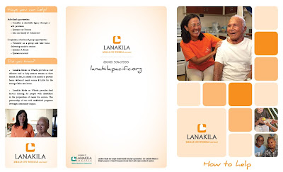
 This promotional brochure is for Lanakila Pacific in Honolulu, HI. Mainly an InDesign piece, it is part of a holistic promotional branding package that I am working on for our organization.
The package will include roughly six brochures, two flyers and a website overhaul.
Of particular note is the consistent use Orange 021 Pantone throughout. It is the same color for all blocks and gradient backgrounds, just the tint was changed from 20% - 60% - 100%.
Attention to detail is the name of the game (#cliche#) when designing brochures. Look closely at the "Sponsor our Seniors" cutoff on the right hand side. You need to be hella OCD to get check boxes and credit card lines looking that clean.
Last, but not least, is the fonts... I chose a Serif font for the body copy (Minion Pro 8pt, throughout), and a creative font named "Daniel" for the heads.
Again, what does this piece mean? Is there any significance? Not really. But, it is another esthetically pleasing way to get our organization's message out.
The best part of this post is your description of the color palette. Not being a graphic design guy, the idea of using the same color at different opacity settings is really ingenious. The sense of cohesion is really strong. Thanks for the explanation!
ReplyDeleteDid you also take the photos or are they stock?