Thursday, May 12, 2011

Loud Shirt Friday

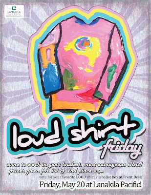
Loud Shirt Friday is a project developed by the Communications Committee at my place of business. I was elated to find out that I could create the flyer and have creative freedom over the finished product.

I've used some new tools available only in Adobe Creative Suite 4 and above (I work in CS 5), like turning effects layers into their own seperate, editable layer. This allows you to build certain effects on top of others.

What does this mean? Well, basically, a stroke can be placed on top of a stroke, and a drop shadow can be placed on top of another drop shadow, etc.

Notice how the "Loud Shirt" seems to be building out into four different colors. This could be done in earlier versions of Creative Suite, but this effect is easier to achieve now.

The feedback around the office on this flyer has been fantastic. Now, let's see what kind of creative LOUD shirts we all come up with ;)

Wednesday, February 23, 2011

C-47

C-47
I was taking a sunset walk when I came across an old clothes line behind a stand of trees. The posts were made of iron and securely anchored into the ground.  The line had seen better days and was quite rusted.

Towards one end of the clothes line were several clothes pins.  I was struck by how completely non-mathematical their arrangement was. I often find myself snapping photos of seemingly 'random' patterns such as coffee stains, liquid spills, bread crumbs, scattered rice or fallen leaves. Normally these things catch my eye because the pattern that appears seems to have a level of organization that belies the organic or accidental origins of the subject.

What I hope to convey with this shot is that peculiar attraction that certain uninteresting objects can have.  It is an allure that resonates with the perfect blandness of the object. I have been told that in the film industry a clothespin is known by the slang term "C-47".

I chose a slightly saturated look for this to bring out the highlights of the setting sun.  I combined this with an overall cooler tone to accentuate the brisk fall environment. I chose a medium f/stop so that all of the clothespins would remain relatively in focus against the background.

ISO: Unknown (probably 200)
F-Stop: 3.5
Exposure: 1/80

Saturday, February 12, 2011

4 Windows


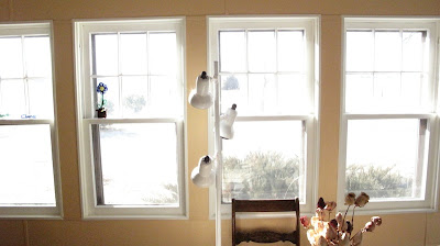
This photograph came about during a day of experimentation with different aperture and shutter speed combinations. The settings for this photograph are identical to the settings for Breakfast. The main difference between the two photos is that 4 Windows uses the regular portrait setting while Breakfast was taken on a macro setting. Also, like Breakfast, there is a strong back light.

The most striking thing in this photograph is the color. There has been no color-correction or post-editing (except for resizing) done. Perhaps it is the gradient provided by the reflected light of the white lamp between the two middle windows that causes the whole composition to have a desaturated look that I find very aesthetically pleasing.

The additional elements of a wooden chair and a vase of roses give this scene some context and mystery and the photographer would like to humbly call the viewer's attention to the small blue flower in the window sill second from left. I really enjoy how this accent of blue contrasts with the consistently warm colors in the rest of the scene.

Aperture: 2.8
Shutter Speed: 1/2,000
ISO: 100

Wednesday, February 9, 2011

Breakfast

This photograph is a study in false perspective. The subject is a peeled orange. My hope is that the first impression the viewer has is of a subject sitting on the floor within a few feet of a door of some kind with light shining through and under. In fact, there are two sources of light that are separated by a distance of about 8 feet. The main light source is the morning sun coming through the kitchen window (roughly 8 feet from the subject). The second source (the bright spot at left-center) is only a few inches from the subject. It is a reflection being thrown by the beveled front of the stove. That these two light sources seem to combine into a single plane of existence is a remarkable illusion in my opinion. Other aspects of composition took a back seat to this effect and in retrospect I would have liked to have had just touch of fill lighting. Perhaps even a small bounce card of come kind throwing some of the sunlight onto the unlit part of the subject.

Aperture: 2.8
Exposure: 1/2,000
ISO: 100

Promotional Lanakila Meals on Wheels brochure


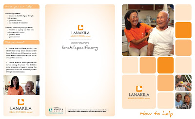
This promotional brochure is for Lanakila Pacific in Honolulu, HI. Mainly an InDesign piece, it is part of a holistic promotional branding package that I am working on for our organization.

The package will include roughly six brochures, two flyers and a website overhaul.

Of particular note is the consistent use Orange 021 Pantone throughout. It is the same color for all blocks and gradient backgrounds, just the tint was changed from 20% - 60% - 100%.

Attention to detail is the name of the game (#cliche#) when designing brochures. Look closely at the "Sponsor our Seniors" cutoff on the right hand side. You need to be hella OCD to get check boxes and credit card lines looking that clean.

Last, but not least, is the fonts... I chose a Serif font for the body copy (Minion Pro 8pt, throughout), and a creative font named "Daniel" for the heads.

Again, what does this piece mean? Is there any significance? Not really. But, it is another esthetically pleasing way to get our organization's message out.